


Last Updated: November 1, 2026
Quick Summary
To choose a capsule wardrobe color palette, start by auditing the clothes you already wear most and let their top two or three colors become your base. Pick one core neutral, add one secondary neutral, then cap color at one accent used in no more than two pieces.
- Sort a drawer into wear weekly, wear rarely, and never wear piles to find your real base colors.
- Pick one core neutral, not two or three, to keep a small wardrobe coherent.
- Run the three-question accent filter before buying any colored piece.
- Cap the accent at one color and no more than two pieces to start.
- Build ten outfits from what you own and buy only gaps that appear three or more times.
Table of Contents
- Start With the Clothes You Already Own
- Pick Your Base and Neutral Capsule Wardrobe Colors
- How to Add Color to a Capsule Wardrobe With Accents
- Test Your Capsule Wardrobe Color Combinations
- Building a Capsule Wardrobe With Prints
- Adapt Your Palette to Your Skin, Season, and Daily Life
- Shop Natural Clothing Company Pieces for Your Palette
- Frequently Asked Questions
Start With the Clothes You Already Own
The fastest way to choose a capsule wardrobe color palette is to look at what you already wear.
A capsule wardrobe is a small, curated set of versatile pieces that mix and match into many outfits.
Try this audit before buying anything:
- Empty one drawer or half a closet onto the bed.
- Sort into three piles: wear weekly, wear rarely, never wear.
- Count the colors in the weekly pile. The top two or three are your real base.
- Note the colors in the never pile. Those are your avoid list.
Most people find they own far more black, navy, or gray than they realized. That is useful information, not a problem. It means the palette is half-built.
Pick Your Base and Neutral Capsule Wardrobe Colors
Neutral capsule wardrobe colors do the heavy lifting. They are the shades that pair with everything, which is why most capsules run on two canvas colors plus one highlight. Get these right and every other decision gets easier.
Choosing a Core Neutral
A core neutral is the color your wardrobe leans on most. It anchors your biggest pieces: pants, skirts, outerwear, and your most-worn tops.
The best core neutral depends on your habits, not trends:
- Black suits city life, evening wear, and low-maintenance laundry.
- Navy blue reads slightly softer and works year-round.
- Gray sits between the two and hides wear well.
Pick one. Not two, not three. For guidance on durable essentials that anchor a minimal wardrobe, see these durable hemp clothing essentials.
A common mistake is choosing a core neutral you love on a hanger but rarely wear.
Adding Secondary Neutrals
Secondary neutrals are the supporting shades that add depth without breaking the palette. They should sit close to your core color and mix with it easily.
Good pairings:
- Black core with gray and white
- Navy core with chambray blue and stone
- Beige core with saddle brown and cream
Two canvas colors is the sweet spot. Three starts to feel like a full wardrobe of neutrals with no room for personality.
How to Add Color to a Capsule Wardrobe With Accents
One highlight color is enough. Accent colors bring a capsule to life, and a single well-chosen accent does more than five scattered ones. The problem is that most guides stop at "pick a color you like." Here is a repeatable way to choose, test, and cap your accent so it actually earns its place.
Run the three-question accent filter
Before you buy anything in color, answer these three questions in writing:
- Does it touch one of my canvas colors? Hold the accent against your core neutral and your secondary neutral. If it fights either one, it is not an accent for this palette, it is a separate palette.
- Can I name three outfits it completes? If you cannot list three specific combinations using pieces you already own, the accent is a want, not a need.
- Will it appear in at least one outfit per week? An accent that lives in the closet is a cost, not a color.
If the answer to any question is no, put the piece back. This filter takes five minutes and prevents the most common capsule mistake: buying color that never coordinates.
Use the accent pairing matrix
A pairing matrix turns "does this go together?" into a yes-or-no check. Build a simple grid with your canvas colors down the side and candidate accents across the top, then mark each cell strong, workable, or skip based on how the two look side by side in daylight.
| Canvas color | Blush pink | Olive | Rust | Cobalt | Mustard |
|---|---|---|---|---|---|
| Black | Strong | Workable | Workable | Strong | Skip |
| Navy | Workable | Workable | Strong | Strong | Workable |
| Gray | Strong | Workable | Workable | Strong | Workable |
| Beige/stone | Strong | Strong | Strong | Skip | Strong |
| Saddle brown | Workable | Strong | Strong | Skip | Strong |
Fill in your own grid with fabric swatches or the actual garments. The cells marked strong are your shortlist. The cells marked skip are the colors you stop considering, which is just as useful as knowing what to buy.
Cap the accent at one color, two pieces
The working rule for a small wardrobe: one accent color, no more than two pieces to start. A cardigan and a scarf in the same accent color read as intentional. Five accent pieces in five different colors read as clutter.
Wear the accent for a month before adding a second. If you reach for it weekly, it has earned a third piece. If you forget it exists, you learned something cheap.
An embroidered detail can carry an accent without a full commitment. An alpaca blend cardigan with embroidery accents is one example of a neutral piece with embroidered color details.
Know when to swap the accent
Accents are the most swappable part of a palette. A core neutral should last years; an accent can rotate seasonally without breaking cohesion. A common pattern is one warm accent for fall and winter and one cooler accent for spring and summer, both filtered through the same three questions and the same matrix. The canvas colors stay put; only the guest changes.
Test Your Capsule Wardrobe Color Combinations
Testing is where a palette stops being a theory and starts being a wardrobe. Lay your pieces out and build outfits before you wear them.
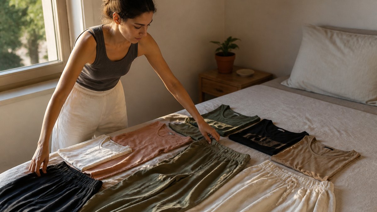
The ten-outfit test works like this:
- Lay every top, bottom, and layer on a flat surface in good light.
- Build ten outfits using only what you own.
- Photograph each one.
- Mark any outfit that needs a piece you do not have.
- Buy only the gaps that appear three or more times.
Most people discover two things. First, they have more outfit combinations than they expected. Second, the gaps are usually one layer or one shoe, not a whole new wardrobe.
Organic Cotton V-neck or Scoop Tee - reversible →
A versatile solid piece makes this test easier. A solid-color linen skirt in a neutral shade can mix easily across many outfits.

Run this test each season. Palettes drift, and a quick reset keeps them tight.
Building a Capsule Wardrobe With Prints
Prints work in a capsule when they borrow colors from the palette you already have. A print is not a new palette.
The rule: every print should contain at least one of your canvas colors. If it does not, it will sit unworn.
A few practical guidelines:
- Choose prints with two or three colors, not six.
- Match the print's background to your core neutral where possible.
- Keep prints to one piece per outfit.
A floral print on a neutral background is the easiest entry point. A flower print linen dress with a neutral base can help coordinate a capsule.
Monochrome outfits are the other half of this. Wearing one color head-to-toe, varied by texture and saturation, looks intentional and needs no print at all.
Adapt Your Palette to Your Skin, Season, and Daily Life
A palette that ignores your coloring, your climate, and your calendar will not survive contact with real life. This section turns those three inputs into a short worksheet you can complete in about fifteen minutes, the repeatable tool most palette guides never provide.
Step 1: Score your natural contrast
The useful question is not "warm or cool" but "how much contrast." Stand in front of a window in daylight with no makeup and hold a white towel under your chin, then a black one.
- High contrast (dark hair against light skin, or light hair against dark skin): strong lights and darks tend to flatter. Lean toward a black, navy, or white canvas and crisper accent colors.
- Medium contrast: most mid-tone canvas colors work. Gray, stone, and denim blue are safe anchors.
- Low contrast (hair and skin close in value): softer, blended shades tend to suit better. Beige, cream, and muted accents often look more harmonious than stark black and white.
Write your contrast level at the top of your worksheet. It narrows your canvas choices before you look at a single garment.
Step 2: Map your climate to fabric and shade weight
Keep the same core palette year-round and adjust weight and light level instead of starting over each season.
- Hot, humid summers: lighter neutrals, linen and other breathable weaves, and accents that read cool (cobalt, soft blue).
- Cold winters: deeper canvas colors, layered textures, and warm accents (rust, mustard).
- Year-round mild climates: two canvas colors carry easily; rotate accents instead of rebuilding.
The goal is one palette that flexes, not four palettes that compete.
Step 3: Count your real occasions
Dress for the week you actually have, not the one you imagine. List your last fourteen days and tally where you went: office, home, errands, evenings out, travel.
A wardrobe built for office days fails a work-from-home schedule. If most of your week is casual, a formal canvas color you rarely wear is a poor anchor no matter how versatile it looks on paper.
Step 4: Fill in the palette worksheet
Combine the three inputs into one page:
| Input | Your answer | What it decides |
|---|---|---|
| Contrast level | High / medium / low | Canvas color range |
| Climate | Hot / cold / mild | Fabric weight and accent temperature |
| Top three occasions | List them | Which pieces get the budget |
| Core neutral | One color | Pants, outerwear, most-worn tops |
| Secondary neutral | One color | Layers and tops |
| Accent | One color | Small doses only |
When the row is filled, you have a palette you can defend. Every future purchase either fits the worksheet or it does not.
Fabric choice matters as much as color for many readers. Sensitivities vary from person to person, so patch-test new pieces and introduce one fabric at a time.
Shop Natural Clothing Company Pieces for Your Palette
Natural Clothing Company has made organic cotton, hemp, and linen clothing since 2008.
Start with the organic cotton reversible tee at $19.50.

Add the organic cotton pants at $48.00. The medium-weight fabric has a substantial feel and a pull-on waistband with a 2" fit.
Finish with the organic cotton crew socks at $10.90. They come in black, natural, navy blue, olive, and white.

Frequently Asked Questions
How many colors should a capsule wardrobe have?
Most capsule wardrobes work well with two canvas colors, two to three secondary neutrals, and one or two accent colors. That gives you roughly five to seven colors total, which is enough to mix and match without decision fatigue. The exact number matters less than whether every piece coordinates with at least two others. If you find yourself needing a sixth neutral to make outfits work, your base colors probably are not versatile enough yet.
What are the best neutral capsule wardrobe colors?
The most versatile neutral capsule wardrobe colors are black, navy blue, gray, beige, white, and stone. Navy and beige tend to be the most forgiving for year-round wear, while black and white offer the sharpest contrast. Saddle brown and denim blue work well as secondary neutrals that add warmth. Pick one or two that match the clothes you already reach for most, then build outward from there rather than starting fresh.
Can prints work in a capsule wardrobe?
Yes, but treat prints as accents rather than staples. Choose one or two prints that contain colors already in your palette, so they coordinate with your solids automatically. A floral skirt in your accent color or a striped tee in your neutrals will mix easily. Avoid prints that introduce entirely new colors, because they force you to buy more pieces to match them and break the mix-and-match logic of a capsule.
How do you make sure capsule wardrobe colors mix and match?
Lay every piece flat and test each top against each bottom before you commit. If a combination looks off, one of those pieces is not pulling its weight. A practical rule is that every top should work with at least two bottoms and every bottom with at least two tops. Keep saturation consistent too: pairing muted tones with muted tones and bright with bright keeps outfits cohesive even when the hues differ.
Building a palette is the easy part. Keeping it tight for years takes discipline, and that is where most capsules quietly fall apart. Natural Clothing Company makes that easier with timeless pieces in organic cotton, hemp, and linen, free from toxic dyes, so each addition fits the palette you built rather than fighting it. Get started with Natural Clothing Company and build a wardrobe where every piece works with the next.


Leave a comment